TXST Logo
Building a distinctive identity in a crowded category
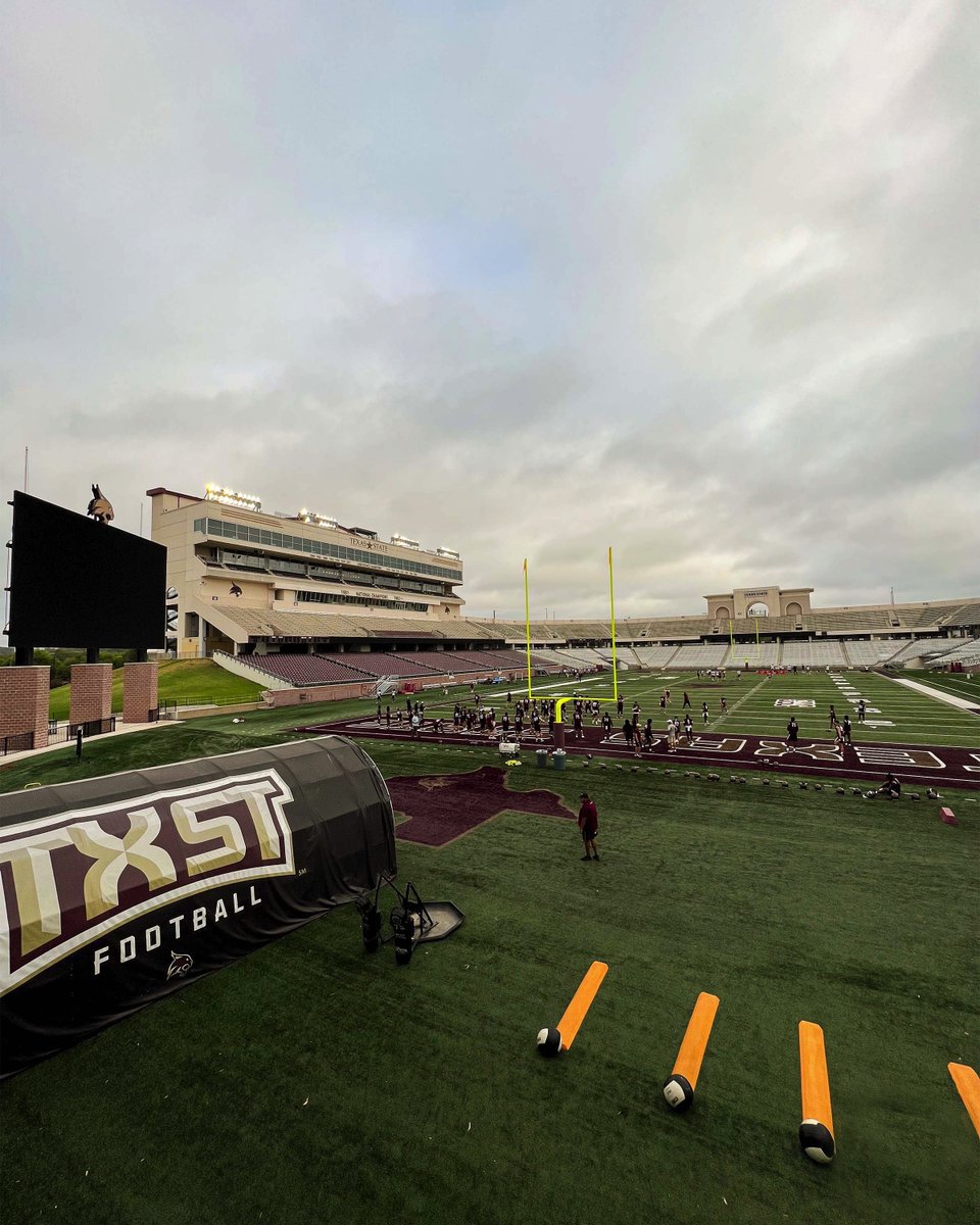
In 2017, I partnered with Texas State Athletics to create the TXST logo—an identity we recognized as uniquely ownable among a crowded field of “TSU” institutions.
It was a chance to build brand equity around a truly differentiated mark. In a space where sameness made recognition difficult, we focused on a clear, versatile shorthand that could unify athletics and academics.
I directed the design team in developing the mark, referencing the university’s visual history—drawing from the curvature and letterforms of the university’s previous SWT identity—while using our custom athletic typeface, Wacker, to create something that felt both rooted and forward-looking.
The result is a simple, bold identifier that works seamlessly across athletics and academics—something that’s often difficult to achieve—and gives the university a clear, ownable presence. We also developed a flexible set of lockups—including versions with “Texas State” and “Bobcats”—to ensure the mark could connect with different audiences while maintaining a consistent identity.


The logo quickly gained traction across campus and has become one of the most widely adopted identifiers for the university. Its impact extended beyond design—by 2022, Texas State transitioned its primary domain to txst.edu, reflecting the strength and recognition of the brand.
Impact
Established a distinctive, trademarked identity unique to Texas State University
Widely adopted across both academic and athletics applications
Strengthened brand recognition and institutional pride
Created a versatile mark used across merchandise, communications, and environments
Supported revenue generation through branded merchandise